An experimental glitch effect powered by CSS animations and the clip-path property. Inspired by the technique seen on the speakers page of the 404 conference.
By Mary Lou in Tutorials on December 21, 2017
From our sponsor: From online stores to member areas, Squarespace is everything you need to sell anything.
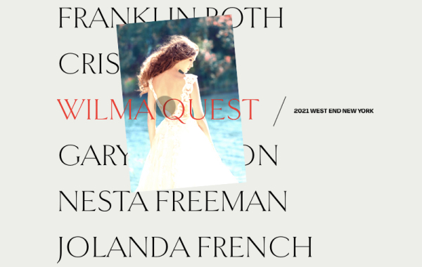
Today we’d like to show you how to create a little experimental glitch-like effect on an image. The effect will be powered by CSS animations and the clip-path property. The technique involves using several layers of images where each one will have a clip-path, a blend mode and a translation applied to it. It was inspired by the technique seen on the speakers page of the 404 conference.
Please note this effect is very experimental; we use several properties that won’t work in older browsers. The clip-path property is not supported in IE or Edge.
We also use CSS variables for setting some properties that will allow for an easy adjustment of the effect.
Breaking down the effect
When searching the web for an easy to use and light-weight glitch implementation, we came across this question on Reddit. Somebody was asking how the glitch effect was pulled off on the speaker line up page of the 404 conference. The glitch effect was made using CSS animations on a stack of three images that are the same. The animations consist of a rapidly changing clip property on all layers except the first one. Additionally, the layers are being moved slightly. So what we are seeing, is slices of the image, slightly offset and in constant movement.
We wanted to experiment with this and recreate the effect using the clip-path property instead. Although it has less browser support (it doesn’t work in IE or Edge), it allows for a more flexible usage since we can use percentage values and apply it to elements that are not necessarily positioned absolutely.
Combining the effect with background blend modes, allows us to create some interesting looking image effects.
The way this works is to create an image stack where each overlaying image will animate its clip-path in, what looks like, random sizes. We’ll use a stack of 5 images:
--이하생략
출저 : https://tympanus.net/codrops/2017/12/21/css-glitch-effect/
By Mary Lou in Tutorials on December 21, 2017
From our sponsor: From online stores to member areas, Squarespace is everything you need to sell anything.
Today we’d like to show you how to create a little experimental glitch-like effect on an image. The effect will be powered by CSS animations and the clip-path property. The technique involves using several layers of images where each one will have a clip-path, a blend mode and a translation applied to it. It was inspired by the technique seen on the speakers page of the 404 conference.
Please note this effect is very experimental; we use several properties that won’t work in older browsers. The clip-path property is not supported in IE or Edge.
We also use CSS variables for setting some properties that will allow for an easy adjustment of the effect.
Breaking down the effect
When searching the web for an easy to use and light-weight glitch implementation, we came across this question on Reddit. Somebody was asking how the glitch effect was pulled off on the speaker line up page of the 404 conference. The glitch effect was made using CSS animations on a stack of three images that are the same. The animations consist of a rapidly changing clip property on all layers except the first one. Additionally, the layers are being moved slightly. So what we are seeing, is slices of the image, slightly offset and in constant movement.
We wanted to experiment with this and recreate the effect using the clip-path property instead. Although it has less browser support (it doesn’t work in IE or Edge), it allows for a more flexible usage since we can use percentage values and apply it to elements that are not necessarily positioned absolutely.
Combining the effect with background blend modes, allows us to create some interesting looking image effects.
The way this works is to create an image stack where each overlaying image will animate its clip-path in, what looks like, random sizes. We’ll use a stack of 5 images:
--이하생략
출저 : https://tympanus.net/codrops/2017/12/21/css-glitch-effect/

어떤 일이라도 노력하고 즐기면 그 결과는 빛을 바란다고 생각합니다.
최신 글
 테스트3
테스트22
테스트
테스트3
테스트22
테스트
인기 글
 Creating a Menu Image Animation on Hover
Inspirational Websites Roundup #41
Creating a Menu Image Animation on Hover
Inspirational Websites Roundup #41
댓글