 javascript
테스트3
ㅌ스트4
테스트4
javascript
테스트22
테스트222
preg_replace('/r|n/', '', $str);
preg_replace('/r|n/', '', $str);
javascript
테스트
테스트1
줄바꿈
줄바꿈22
 css
css
3D Grid Effect
A proof-of-concept effect recreation of the animation seen in a prototype app by Marcus Eckert. The idea is to flip a grid item in 3D, expand it to fullscreen and reveal some associated content. We’ve created two demos with a vertical and a horizontal rotation.
By Mary Lou in Playground on March 27, 2014
From our sponsor: Sell access to courses, classes, and community with Squarespace.
Today we’d like to share a little animation concept with you. It’s the recreation of an effect we spotted in this fantastic prototype app by Marcus Eckert. The idea is to rotate a grid item in 3D, expand it into fullscreen and reveal some content. For our attempt to imitate the app behavior, we created two demos. In the first one we rotate the grid item vertically and in the second one horizontally.
Please note that this is just a proof-of-concept and that we are using several CSS properties that might not work in every browser (pointer-events, 3D Transforms, CSS Transitions). It is highly experimental and for browsers not supporting either one of those properties, we provide a simple fallback that just shows and hides the content.
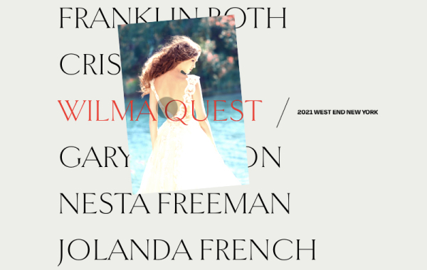
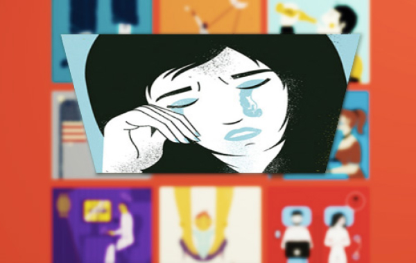
The amazing illustrations featured in the demos are by Adam Quest. View all images from the Selected editorials 2014 Vol.1 on Behance and visit his Facebook page.
The way we simulate the effect seen in the prototype app video, is by creating a placeholder element that will have a front and a back face. The front will contain a copy of the grid item content and the back will be white. When clicking on a grid item, we add the absolutely positioned placeholder and position it in the clicked item’s position. Then we animate its width and height to the window’s width and height and set the top and left to negative values, making it move outside of the grid into the top left corner of the page. While we are doing that, we’ll also rotate the element in 3D, revealing the white back side of the placeholder. Once it fills the screen, we’ll fade in the content which we stored in a different division.
The illusion, that it’s actually the grid item that flies out and rotates, is completed by fading out the clicked grid item so that we can only see the placeholder being moved out of the grid.
In addition to the placeholder moving towards the viewer, we also move the grid away by translating it on the Z-axis.
Please note, that this is just a proof-of-concept. You might want to load your content dynamically (see the dummy loading effect) or show something else as the main content, i.e. a fullscreen image. The fallback is also very simple and general.
Let’s take a look at the markup and some important styles to understand the concept of how the effect is done.
We have a main section element which contains a division for the grid and one for the content:
--이하생략
출저 : https://tympanus.net/codrops/2014/03/27/3d-grid-effect/
 html
html
Inspiration for Text Input Effects
Some inspiration for effects on text inputs using CSS transitions, animations and pseudo-elements.
By Mary Lou in Playground on January 8, 2015
From our sponsor: Sell access to courses, classes, and community with Squarespace.
Form inputs offer a great opportunity to add some subtle and interesting effects to a web page. They are elements that your user will interact with at some point and making them fun to use can enhance the experience. We are used to the default form resembling its paper counterpart but in the digital world we can be more creative. Today we want to share some experimental styles and effects for text inputs with you. Andrej Radisic has done some great work on Dribbble, like the Jawbreaker input field, which we’ve based one of the effects on. Most of the effects use CSS transitions together with pseudo-elements.
Please note that this is for inspiration only and that we use CSS properties which only work in modern browsers.
For the markup we use a span as a wrapper for the input and its label. For the effects to work, we are putting the label after the input which usually should only be done when using checkboxes and radio inputs. This is not necessary if you rely entirely on dynamically adding a class that will trigger what we do on focus. For the purpose of this demo, we are going to rely on the CSS :focus pseudo-class as well to show its potential in combination with the adjacent sibling selector. But you can use a more semantic order together with the trigger class we also use in order to keep the inputs open that get filled (and can’t be closed due to the label position). Note that not all effects have the trigger class (input–filled) defined in the CSS.
--이하생략
출저 : https://tympanus.net/codrops/2015/01/08/inspiration-text-input-effects/
 css
css
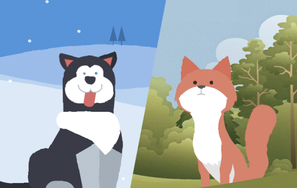
Animated Animals in CSS and SVG
Learn some interesting animation techniques involving Sass and SVG filters for realistic motion effects on the example of animated animals.
By David Khourshid in Tutorials on March 21, 2016
From our sponsor: Create stunning brand assets with the help of our AI-driven Creative Assistant. Get started today.
Today we want to show you how the clever use of HTML, CSS sequenced animations, and SVG filters can bring to life one of the most unlikely (yet adorable) things to be seen on a web page – animals. We’ll explore two techniques for drawing the animals: one with plain HTML and CSS, and one with inline SVG background images.
This demo is highly experimental – animated SVG filters are currently only available in Chrome.
The animations involved are also complex, so this tutorial will focus on the different techniques involved in creating each of these creatures and their life-like movements. It’s up to you to let your creative juices flow and create unique and playful animated animals on your own.
With that said, let’s get started!
Shaping the Animals
The demos use two different techniques for creating the shapes of the different body parts of the animals. The husky uses CSS border-radius properties, and the fox uses inline background SVG images, as the shapes are more complex.
The Markup
Both animals use nested HTML divisions to group the body parts. The concept of grouping is important for creating life-like movements — when the head moves, the eyes and ears should always move too, as they are attached to the head.
--이하생략
출저 : https://tympanus.net/codrops/2016/03/21/animated-animals-css-svg/
 css
css
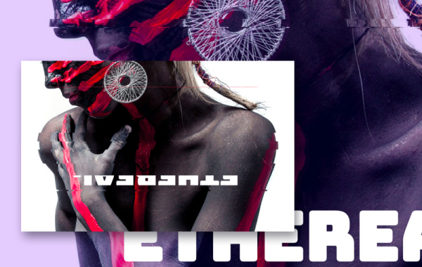
Background Segment Effect
A background image segment effect as seen on Filippo Bello’s Portfolio, employing the CSS clip-path property and powered by anime.js.
By Mary Lou in Playground on September 21, 2016
From our sponsor:Get suggestions for improving your content, targeting, and marketing automations to help you increase revenue.
Today we’d like to share a little decorative effect with you that we’ve encountered on Filippo Bello’s Portfolio, maybe you’ve seen it. It’s a really neat way to add some jazz to background images. The idea is to replicate boxes from a background with the same background image and make these boxes move in perspective towards the viewer. Adding a fitting shadow and some parallax makes all this look quite interesting. Furthermore, we’re employing anime.js, the easy-to-use JavaScript animation library by Julian Garnier.
Have a look at the effect seen on Filippo’s portfolio:
The technique that we use for this effect is based on the CSS clip-path property. Although the technique seen on Filippo’s portfolio uses a different approach (background-size: cover combined with background-attachment: fixed), we found that Firefox does not seem to like that combination.
Update: After first using just the CSS clip property, we’ve updated the script to use clip-path when supported. CSS clip is deprecated but still works as a great fallback for clip-path (rectangular shapes). Thanks to Larry for pointing that out in the comments!
Attention: We are using 3D Transforms which are not supported in older browsers.
--이하생략
출저 : https://tympanus.net/codrops/2016/09/21/background-segment-effect-with-css-clip/
 html
html
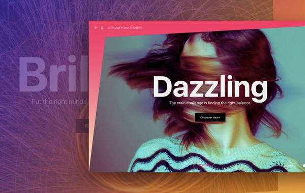
Animated SVG Frame Slideshow
An experimental slideshow that shows an animated SVG frame when transitioning between slides. Different shapes can be used for creating a variety of styles.
By Mary Lou in Playground on November 15, 2017
From our sponsor: From online stores to member areas, Squarespace is everything you need to sell anything.
Today we’d like to share an experimental slideshow with you. The idea is to animate an SVG frame while we transition from one slide to another. Using different shapes we can create a variety of frame styles when morphing the SVG path. The inspiration for this idea is based on the Dribbble shot MEDIOCRE: 06 by Shota. We are using anime.js for the animations.
This demo is kindly sponsored by Sencha: Create data-intensive, feature-rich web and mobile apps with Sencha Ext JS.
If you would like to become a demo sponsor, you can find out more here.
Attention: For the demo we use some modern CSS properties like CSS Flexbox and CSS variables, so please view them in a up-to-date browser.
Have a look at some screenshots:
Here we are animating a simple box-like shape:
In this demo we used a pattern for the fill of the shape which is a slightly skewed rectangle. The pattern is from Hero Patterns:
출저 : https://tympanus.net/codrops/2017/11/15/animated-svg-frame-slideshow/
 html
html
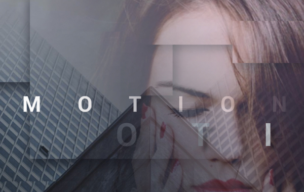
CSS Glitch Effect
An experimental glitch effect powered by CSS animations and the clip-path property. Inspired by the technique seen on the speakers page of the 404 conference.
By Mary Lou in Tutorials on December 21, 2017
From our sponsor: From online stores to member areas, Squarespace is everything you need to sell anything.
Today we’d like to show you how to create a little experimental glitch-like effect on an image. The effect will be powered by CSS animations and the clip-path property. The technique involves using several layers of images where each one will have a clip-path, a blend mode and a translation applied to it. It was inspired by the technique seen on the speakers page of the 404 conference.
Please note this effect is very experimental; we use several properties that won’t work in older browsers. The clip-path property is not supported in IE or Edge.
We also use CSS variables for setting some properties that will allow for an easy adjustment of the effect.
Breaking down the effect
When searching the web for an easy to use and light-weight glitch implementation, we came across this question on Reddit. Somebody was asking how the glitch effect was pulled off on the speaker line up page of the 404 conference. The glitch effect was made using CSS animations on a stack of three images that are the same. The animations consist of a rapidly changing clip property on all layers except the first one. Additionally, the layers are being moved slightly. So what we are seeing, is slices of the image, slightly offset and in constant movement.
We wanted to experiment with this and recreate the effect using the clip-path property instead. Although it has less browser support (it doesn’t work in IE or Edge), it allows for a more flexible usage since we can use percentage values and apply it to elements that are not necessarily positioned absolutely.
Combining the effect with background blend modes, allows us to create some interesting looking image effects.
The way this works is to create an image stack where each overlaying image will animate its clip-path in, what looks like, random sizes. We’ll use a stack of 5 images:
--이하생략
출저 : https://tympanus.net/codrops/2017/12/21/css-glitch-effect/
 html
html
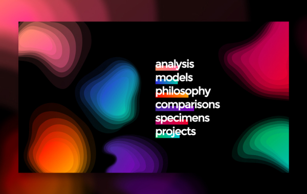
Gradient Topography Animation
An organic SVG shape layer animation based on Diana Hlevnjak’s work “Gradient Topography”. Powered by anime.js.
By Mary Lou in Playground on January 24, 2018
.
From our sponsor: From online stores to member areas, Squarespace is everything you need to sell anything.
Today we’d like to share a shape layer animation with you. The inspiration for this effect comes from the fantastic work by Diana Hlevnjak (Polar Vector) “Gradient Topography”. We use anime.js for the animations and Charming for the letter effects.
After seeing the artwork, we thought it would be awesome to animate these kind of gradient layers of an organic shape in an interesting way. For this we’ve created a little layout that has several shapes spread on the page and when a menu item is clicked, the associated shape group will expand to full screen and some content is shown.
The demo is kindly sponsored by monday.com: The perfect project management tool for designers. If you would like to sponsor one of our demos, find out more here.
Attention: We’re using CSS variables, grid and flexbox for the demos, so please view this with a modern browser.
The organic shapes consist of path layers where each one has the same gradient but a decreasing fill opacity. This creates an interesting look and when animated, fills the entire screen with the semi transparent layers until it’s fully opaque after the last layer enlarges. The other shapes scale down.
Have a look at some screenshots:
--이하생략
출저 : https://tympanus.net/codrops/2018/01/24/gradient-topography-animation/