 javascript
How to Bring Your Website to Life with UI Animation
Web design can feel pretty predictable these days. If you want to differentiate your website from the pack, bring some excitement to it with UI animation.
In Articles on November 9, 2020 Sponsored
Websites are pretty predictable these days. Visitors know exactly where to go to navigate the site, which pages contain the specific information they need, as well as how to utilize certain features.
But what if you could add a little excitement to their visit with interactive and moving elements?
Below, we’re going to look at 6 types of UI animation that will bring a little life to your designs and, consequently, increase visitor engagement with your content. We’ll show you some examples — from BeTheme’s pre-built websites as well as from sites around the web — that subtly use motion to give more power to your static content.
Inspiring examples of UI animation in web design
UI animation doesn’t need to be over the top in order to be effective. It simply needs to blend well with the brand’s style and be used just enough to capture your visitors’ attention.
One thing to keep in mind is this:
When choosing the element to animate, make sure it’s one you want visitors focusing on or engaging with. If it doesn’t help move visitors along in their journey, then it’s just a wasted opportunity.
Here are some UI animation ideas for you to draw inspiration from:
1. Transform primary buttons or blocks with motion and color
Websites — and, in particular, the homepage — contain a bunch of clickable links, buttons, and blocks. With so many other pages to explore, these on-page links are necessary for pointing visitors in the right direction.
That said, not every internal link is made equal. And you can use various types of animation to demonstrate where the most important information is.
When visitors encounter primary CTAs — ones that drive them to the meat of what the website sells — use transformational animations to really make them pop.
For example, here’s how REQ transforms these blocks on the homepage:
--이하생략
출저 : https://tympanus.net/codrops/2020/11/09/how-to-bring-your-website-to-life-with-ui-animation/
 jquery
Image Stack Intro Animation
Two simple intro animations where an image stack moves to become a grid.
By Mary Lou in Playground on November 24, 2020
From our sponsor: Sell access to courses, classes, and community with Squarespace.
Today I want to share a simple intro animation with you. The concept is to first show an image stack and then animate each image to its position in the grid (or any other layout).
For the first demo, I actually used a simple serial layout and added some smooth scrolling with Locomotive Scroll. The animations are powered by GSAP.
The inspiration for this animation came from this beautiful intro animation Dribbble shot by Gil.
In the first demo the stack images move to a simple consecutive layout:
In the second demo, the images move to their respective position in the grid:
I really hope you have fun with this and thanks for checking it out!
출저 : https://tympanus.net/codrops/2020/11/24/image-stack-intro-animation/
 jquery
11 Massive Cyber Monday 2020 Deals With Up to 94% Off
Find out where you can get exclusive Cyber Monday deals for web professionals with great discounts.
In Articles on November 30, 2020 Sponsored
Black Friday and Cyber Monday are two of the year’s main shopping events. For online shoppers they are anticipated to be as rewarding as ever.
New and upgraded products often appear for the first time on Cyber Monday along with many longtime favorites. Web designers in particular will have an opportunity to purchase products or resources they have been needing for some time. Or, have a use for but didn’t even know they existed.
That said, here are 11 Cyber Monday specials, any one of which might just make your day!
1. Amelia WordPress Booking Plugin
Despite its time and money saving features and capabilities, Amelia is a lightweight and straightforward appointment and event management system for businesses to use, including front-end panels for their clients and employees.
Amelia is by far the best-selling WordPress booking plugin.
It is been placed in use by more than 30,000 businesses to date, including healthcare, beauty, sports, educational, and other industries
It replaces manual and semi-automated appointment booking and management systems with a fully automated, error free, and easy to work with application.
Amelia manages appointments, events, user, customer, and employee roles, services, and notifications at both single and multiple locations.
Amelia integrates seamlessly with Google and Outlook calendars, WooCommerce, and Zoom.
Several plans are available including annual, lifetime, basic, pro and developer.
It is a time saver that helps you gain more satisfied customers, and higher employee morale
Click on the banner to learn about Amelia’s features, including its front-end and back-end views. All licenses are offered at a 30% Cyber Monday discount....
--이하생략
출저 : https://tympanus.net/codrops/2020/11/30/11-massive-cyber-monday-2020-deals-with-up-to-94-off/
 jquery
Recreating a Dave Whyte Animation in React-Three-Fiber
Learn how to use instanced rendering and post-processing techniques to recreate a hypnotic looping animation with react-three-fiber.
By Matt Rossman in Tutorials on December 17, 2020
From our sponsor: Squarespace is everything you need to sell anything: your brand, products, services, or content.
There’s a slew of artists and creative coders on social media who regularly post satisfying, hypnotic looping animations. One example is Dave Whyte, also known as @beesandbombs on Twitter. In this tutorial I’ll explain how to recreate one of his more popular recent animations, which I’ve dubbed “Breathing Dots”. Here’s the original animation:
The Tools
Dave says he uses Processing for his animations, but I’ll be using react-three-fiber (R3F) which is a React renderer for Three.js. Why am I using a 3D library for a 2D animation? Well, R3F provides a powerful declarative syntax for WebGL graphics and grants you access to useful Three.js features such as post-processing effects. It lets you do a lot with few lines of code, all while being highly modular and re-usable. You can use whatever tool you like, but I find the combined ecosystems of React and Three.js make R3F a robust tool for general purpose graphics.
View the template
I use an adapted Codesandbox template running Create React App to bootstrap my R3F projects; You can fork it by clicking the button above to get a project running in a few seconds. I will assume some familiarity with React, Three.js and R3F for the rest of the tutorial. If you’re totally new, you might want to start here.
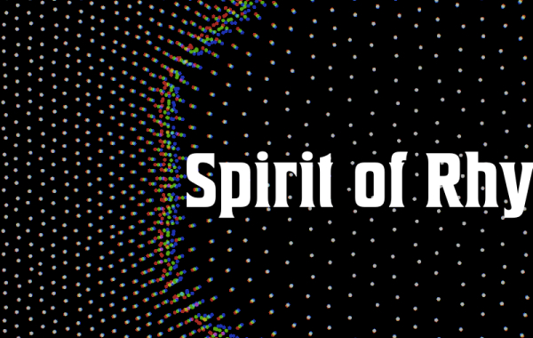
Step 1: Observations
First things first, we need to take a close look at what’s going on in the source material. When I look at the GIF, I see a field of little white dots. They’re spread out evenly, but the pattern looks more random than a grid. The dots are moving in a rhythmic pulse, getting pulled towards the center and then flung outwards in a gentle shockwave. The shockwave has the shape of an octagon. The dots aren’t in constant motion, rather they seem to pause at each end of the cycle. The dots in motion look really smooth, almost like they’re melting. We need to zoom in to really understand what’s going on here. Here’s a close up of the corners during the contraction phase:
--이하생략
출저 : https://tympanus.net/codrops/2020/12/17/recreating-a-dave-whyte-animation-in-react-three-fiber/
 javascript
New Web Design Trends and Inspiration for 2021
Web design trends come and go. Thanks to the upheaval in 2020, web designers are going to see some common trends fall by the wayside for safer design choices.
In Articles on January 11, 2021 Sponsored
This article is sponsored by BeTheme.
We had a heck of a year in 2020. Businesses were forced to pivot in new and creative ways. Consumers had to adjust. As a result, the web needed to change, too.
Before we get too far into 2021, it’s absolutely critical that we reflect on the changes of the past year. Because many of the web design trends that worked for pre-2020 consumers and businesses aren’t going to work anymore.
Today, we’re going to look at what the newest design trends will look like, why they’ve come about, and we’ll also check out examples of websites and BeTheme pre-built sites that are already making good use of them.
Whether you’re designing a site for a new client or you want to pivot an existing client’s site to align with post-2020 design trends, keep reading:
1. Use more comforting color palettes
In years past, web design trends lists favored bolder color palettes and gradient schemes. If you wanted to quickly capture a visitor’s attention and elicit an emotional response, you’d use strong colors to do so.
But with all the drama, panic and fear that dominated 2020, we’re going to see brands tone down their usage of color in 2021.
That doesn’t mean that color can’t still be used to inspire visitors to feel a certain way. It just means that color palettes will inspire feelings of calm, comfort, and safety this year.
Bellroy, for example, is a company that sells carry goods — things like wallets, bags, and phone cases that keep people’s items safe and organized:
Although some of its products come in bright colors, the white space and photo backgrounds used on the website lean towards a more neutral and natural color palette.
The BeSpa pre-built website is another good example of soothing colors done right:
As you can see, a tamer color palette doesn’t have to translate to boring. It’s simply prioritizing a different set of priorities and emotions; namely, security and comfort.
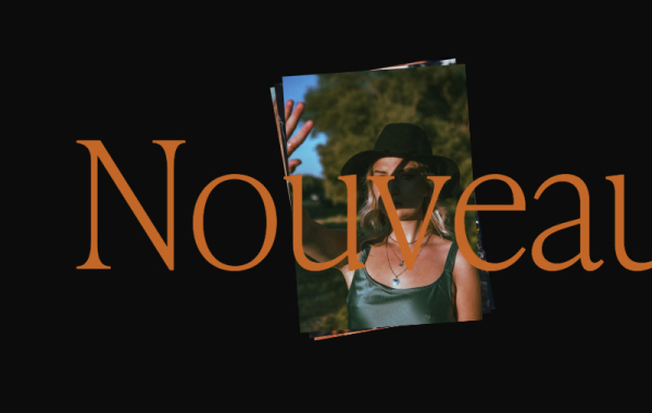
2. Seamlessly blend physical and digital imagery
Many people were stuck at home with very little to do but look at their screens in 2020. This led to a greater blending of their real lives with their digital ones.
In the past, web designers generally focused on creating websites with either photos or illustrations.
Photos allowed brands to depict real world scenarios as well as to show off their actual products. Illustrations, on the other hand, were useful for depicting abstract concepts and to explain highly technical products.
However, now that the line has blurred between the physical and digital worlds, web design can start reflecting this change, too. It doesn’t need to be one or the other.
Here’s an example of this in action from fashion designer Constance Burke:
Her portfolio could’ve gone either way in the past (i.e. real models wearing clothing she’s designed or a lookbook of hand-drawn fashion sketches). But she’s blended the two here in a very creative way.
You might also consider blending the physical and digital similar to how the BeSki pre-built site does:
출저 :https://tympanus.net/codrops/2021/01/11/new-web-design-trends-and-inspiration-for-2021/
 javascript
Circular SVG Text Animation
Exploring some experimental circular SVG text effects for an intro animation.
By Mary Lou in Playground on March 3, 2021
From our sponsor: Target your best customers and see up to 88% more revenue with Predictive Segments. Sign up today.
The other day I looked at some nice animations that I always wanted to code up somehow. One of them was this gem by Twotwentytwo and Nathan Riley from 2019:
Furthermore, there’s another beautiful animation that I have stumbled upon recently called Spiral Scheduler by Michael Crawford. Go check it out on, it’s such a smooth animation.
The idea of using circular typography is really awesome and therefore I wanted to explore some animations with it. To do this, I used an SVG with texts on circular paths. There’s a really great article by Amelia Bellamy-Royds that explains how to make them, it’s a great read: Perfecting Paths for
I thought it would be nice to make some kind of intro animation and play with different scale effects. There are a lot of possibilities, for the look and for the feel of the animation. So here are three demos for you to explore and hopefully they give you some inspiration for some circular motion design.
Let me know what you think and thank you for checking by!
출저 : https://tympanus.net/codrops/2021/03/03/circular-svg-text-animation/
 javascript
Shape Slideshow with Clip-path
An experimental slideshow using clip-path to create shape transitions between slides.
By Mary Lou in Playground on March 10, 2021
From our sponsor: Reach inboxes when it matters most with Mailchimp's data-backed email automations. Sign up for Mailchimp now.
Rounded shapes are back in fashion! Specifically, pill shaped forms are really hot right now, as can be seen on Icelandic Explorer for example:
On Gucci Beauty you can see many rounded shapes, especially rounded cards:
Window-like shapes are also super trendy, as can be seen in this beautiful poster design by Ana Sakac:
Another example is this great design by mashiqo:
I recently also stumbled across this beautiful Dribbble shot by Tyshchuk Maryna:
I thought that this might be somehow possible to do with a clip-path animation, so I started experimenting. It turns out that by using any kind of
As a result, I have created four demos showing some ideas that might spark your inspiration. I really hope you like them!
Here is that pill-shaped look I was after:
Note that for non-supporting browsers, we’ll simply see the slide move without a clip-path applied to it.
Thank you for checking by and hope you enjoy this!
출저 : https://tympanus.net/codrops/2021/03/10/shape-slideshow-with-clip-path/
 javascript
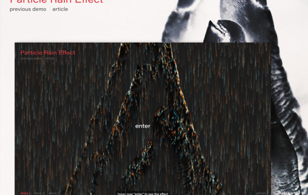
Tropical Particles Rain Animation with Three.js
A WebGL particle rain animation resulting in an interesting image effect made with Three.js.
By Yuriy Artyukh in Playground on March 17, 2021
From our sponsor:Get suggestions for improving your content, targeting, and marketing automations to help you increase revenue.
People always want more. More of everything. And there is nothing better in the world to fulfil that need than particle systems. Because you can have thousands of particles easily. And that’s what I did for this demo.
Creating a particle system
You start with just one particle. I like to use classes for that, because that perfectly describes the behaviour of particles. It usually it looks like this:
And after all of that, you could render them. Sounds easy, right? It is!
Physics
So the particles need to move. For that we need to establish some rules for their movement. The easiest one is: gravity. Implemented in the particle it would look like this:
With that you will get this simple rain. I also randomized gravity for each particle. Why? Because I can!
But just rain didn’t seem enough, and I decided to add a little bit of physics to change the speed of the particles. To slow them down or speed them up, depending on the… image. Yup, I took the physics for the particles from the image. My friend @EncharmDre proposed to use some oscillations for the particles, and I also added some colors palettes here. It looked amazing! Like a real tropical rain.
Still, the physics part is the computational bottleneck for this animation. It is possible to animate millions of particles by using GPGPU techniques, and the GPU to calculate the positions. But 10000 particles seemed enough for my demo, and I got away with CPU calculations this time. 10s of thousands also were possible because I saved some performance on rendering.
Rendering
There are a lot of ways to render particles: HTML, Canvas2D, WebGL, SVG, you name it. But so far the fastest one is of course WebGL. It is even faster than Canvas2D rendering. I mean, of course Canvas2D works perfectly fine for particles. But with WebGL you could have MORE OF THEM! Which is the point of this whole adventure =).
So, WebGL narrowed down the search for rendering to a couple of frameworks. PIXI.js is actually very nice for rendering 2D particle systems, but because I love three.js, and because its always nice to have another dimension as a backup (the more dimensions the better, remember?), I chose three.js for this job.
There is already an object specifically for this job: THREE.Points. I also decided to use shaders (because it’s cool) but you could actually easily avoid that for this demo.
The simplified code looks somewhat like this:
To make it even cooler, I decided to create trails for the particles. For that I just used the previous rendering frame, and faded it a little bit. And here is what I got:
Now combining everything, we could achieve this final look:
Final words
I beg you to try this yourself, and experiment with different parameters for particles, or write your own logic for their behavior. It is a lot of fun. And you could be the ruler of thousands or even millions of… particles!
 javascript
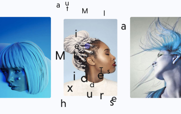
Distributed Letters Animation Layout
A distributed letters animation in the context of a triple panel layout with hover effect.
By Mary Lou in Playground on March 24, 2021
From our sponsor: Squarespace is everything you need to sell anything: your brand, products, services, or content.
A while back I stumbled upon this great Dribbble shot by Seth Eckert. I love that letter effect and so I was thinking about a layout where I could incorporate this kind of animation.
After playing around a bit, I thought that a layout that allows for opening a panel would be interesting. So here it is; a little layout with a distributed letter animation on hover. When clicking, the letters will move to their respective place in the panel and the other elements will animate in.
I really hope you like this and that it comes in handy.
Thank you for checking by!
출저 : https://tympanus.net/codrops/2021/03/24/distributed-letters-animation-layout/
 javascript
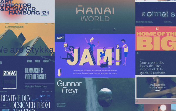
Inspirational Websites Roundup #24
A fresh collection of hand-picked websites with interesting and outstanding designs to get you updated on the current trends.
By Mary Lou in Websites Roundups on March 30, 2021
From our sponsor:Get suggestions for improving your content, targeting, and marketing automations to help you increase revenue.
It’s always such a pleasure to make these roundups of wonderful designs. It gives a glimpse into what the current trends are and what could be the next cool thing when it comes to colors, layout and typography.
This past month some amazing design were unleashed upon the web, reflecting the immense diversity of ideas. It’s exciting to see new shapes being used enhancing individual layouts. Expressive typography is becoming more prominent and is used to define the mood and character of each design.
I really hope you enjoy this roundup and find it inspirational!