 css
css
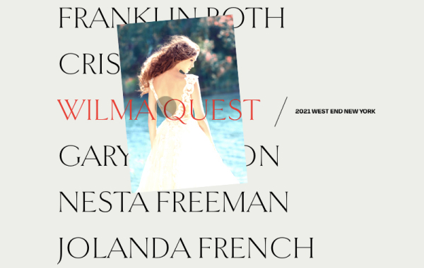
3D Grid Effect
A proof-of-concept effect recreation of the animation seen in a prototype app by Marcus Eckert. The idea is to flip a grid item in 3D, expand it to fullscreen and reveal some associated content. We’ve created two demos with a vertical and a horizontal rotation.
By Mary Lou in Playground on March 27, 2014
From our sponsor: Sell access to courses, classes, and community with Squarespace.
Today we’d like to share a little animation concept with you. It’s the recreation of an effect we spotted in this fantastic prototype app by Marcus Eckert. The idea is to rotate a grid item in 3D, expand it into fullscreen and reveal some content. For our attempt to imitate the app behavior, we created two demos. In the first one we rotate the grid item vertically and in the second one horizontally.
Please note that this is just a proof-of-concept and that we are using several CSS properties that might not work in every browser (pointer-events, 3D Transforms, CSS Transitions). It is highly experimental and for browsers not supporting either one of those properties, we provide a simple fallback that just shows and hides the content.
The amazing illustrations featured in the demos are by Adam Quest. View all images from the Selected editorials 2014 Vol.1 on Behance and visit his Facebook page.
The way we simulate the effect seen in the prototype app video, is by creating a placeholder element that will have a front and a back face. The front will contain a copy of the grid item content and the back will be white. When clicking on a grid item, we add the absolutely positioned placeholder and position it in the clicked item’s position. Then we animate its width and height to the window’s width and height and set the top and left to negative values, making it move outside of the grid into the top left corner of the page. While we are doing that, we’ll also rotate the element in 3D, revealing the white back side of the placeholder. Once it fills the screen, we’ll fade in the content which we stored in a different division.
The illusion, that it’s actually the grid item that flies out and rotates, is completed by fading out the clicked grid item so that we can only see the placeholder being moved out of the grid.
In addition to the placeholder moving towards the viewer, we also move the grid away by translating it on the Z-axis.
Please note, that this is just a proof-of-concept. You might want to load your content dynamically (see the dummy loading effect) or show something else as the main content, i.e. a fullscreen image. The fallback is also very simple and general.
Let’s take a look at the markup and some important styles to understand the concept of how the effect is done.
We have a main section element which contains a division for the grid and one for the content:
--이하생략
출저 : https://tympanus.net/codrops/2014/03/27/3d-grid-effect/
 css
css
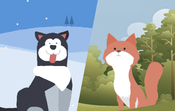
Animated Animals in CSS and SVG
Learn some interesting animation techniques involving Sass and SVG filters for realistic motion effects on the example of animated animals.
By David Khourshid in Tutorials on March 21, 2016
From our sponsor: Create stunning brand assets with the help of our AI-driven Creative Assistant. Get started today.
Today we want to show you how the clever use of HTML, CSS sequenced animations, and SVG filters can bring to life one of the most unlikely (yet adorable) things to be seen on a web page – animals. We’ll explore two techniques for drawing the animals: one with plain HTML and CSS, and one with inline SVG background images.
This demo is highly experimental – animated SVG filters are currently only available in Chrome.
The animations involved are also complex, so this tutorial will focus on the different techniques involved in creating each of these creatures and their life-like movements. It’s up to you to let your creative juices flow and create unique and playful animated animals on your own.
With that said, let’s get started!
Shaping the Animals
The demos use two different techniques for creating the shapes of the different body parts of the animals. The husky uses CSS border-radius properties, and the fox uses inline background SVG images, as the shapes are more complex.
The Markup
Both animals use nested HTML divisions to group the body parts. The concept of grouping is important for creating life-like movements — when the head moves, the eyes and ears should always move too, as they are attached to the head.
--이하생략
출저 : https://tympanus.net/codrops/2016/03/21/animated-animals-css-svg/
 css
css
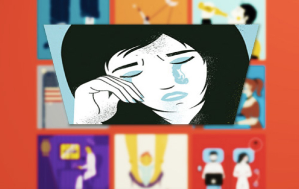
Background Segment Effect
A background image segment effect as seen on Filippo Bello’s Portfolio, employing the CSS clip-path property and powered by anime.js.
By Mary Lou in Playground on September 21, 2016
From our sponsor:Get suggestions for improving your content, targeting, and marketing automations to help you increase revenue.
Today we’d like to share a little decorative effect with you that we’ve encountered on Filippo Bello’s Portfolio, maybe you’ve seen it. It’s a really neat way to add some jazz to background images. The idea is to replicate boxes from a background with the same background image and make these boxes move in perspective towards the viewer. Adding a fitting shadow and some parallax makes all this look quite interesting. Furthermore, we’re employing anime.js, the easy-to-use JavaScript animation library by Julian Garnier.
Have a look at the effect seen on Filippo’s portfolio:
The technique that we use for this effect is based on the CSS clip-path property. Although the technique seen on Filippo’s portfolio uses a different approach (background-size: cover combined with background-attachment: fixed), we found that Firefox does not seem to like that combination.
Update: After first using just the CSS clip property, we’ve updated the script to use clip-path when supported. CSS clip is deprecated but still works as a great fallback for clip-path (rectangular shapes). Thanks to Larry for pointing that out in the comments!
Attention: We are using 3D Transforms which are not supported in older browsers.
--이하생략
출저 : https://tympanus.net/codrops/2016/09/21/background-segment-effect-with-css-clip/
 css
css
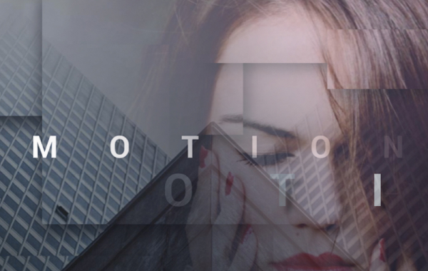
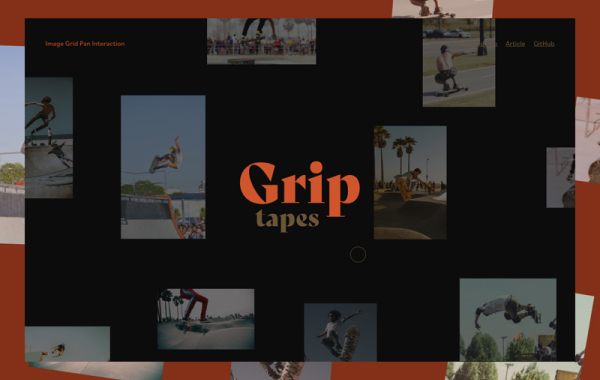
How to Create a Motion Hover Effect for a Background Image Grid
A short tutorial on how to achieve a motion hover effect on a background image grid.
By Mary Lou in Tutorials on June 10, 2020
From our sponsor: From online stores to member areas, Squarespace is everything you need to sell anything.
If you follow our UI Interactions & Animations Roundups, you might have spotted this beautiful grid designed by the folks of tubik:
Previously, Zhenya Rynzhuk also designed this wonderful layout with a similar interaction:
It’s not too complicated to implement this. I wanted to try it and in the following I’ll walk you through the relevant markup and code.
The markup and style for the grid
The markup is simply a grid of items that have background images. I like to use this structure because it allows me to control the sizes of the images by setting their position in the grid.
--이하생략
출저 : https://tympanus.net/codrops/2020/06/10/how-to-create-a-motion-hover-effect-for-a-background-image-grid/
 css
css
Making Stagger Reveal Animations for Text
A short tutorial on how to recreate a letter stagger animation with GSAP and Splitting.js.
By Mary Lou in Tutorials on June 17, 2020
From our sponsor: Create stunning brand assets with the help of our AI-driven Creative Assistant. Get started today.
Thibaud Allie made this wonderful animation which you can see live on the site of Dani Morales. It happens when you click on “About” (and then “Close”). This kind of show/hide animation on the typographic elements is being used in many designs lately. At Codrops we call it a “reveal” animation.
I fell in love with that lettering effect and wanted to reimplement it using GSAP and Splitting.js. So I made a similar typography based layout and move the lines of text by staggering the letter animations.
The simplified markup looks like this:
Note that the necessary style for the content__paragraph element is overflow: hidden so that the reveal/unreveal animation works.
All elements with the “data-splitting” attribute will be split up into spans that we can then animate individually. So let’s have a look at the JavaScript for that.
Initially, we need to import some libraries and styles:
--이하생략
출저 : https://tympanus.net/codrops/2020/06/17/making-stagger-reveal-animations-for-text/